Three builds. All ours. All checkable.
We do not have a portfolio of logos to show you. We have three real businesses we built sites for, starting with our own, and every claim below is one you can verify yourself. The first one is the deep study. Open it on your phone while you read this.
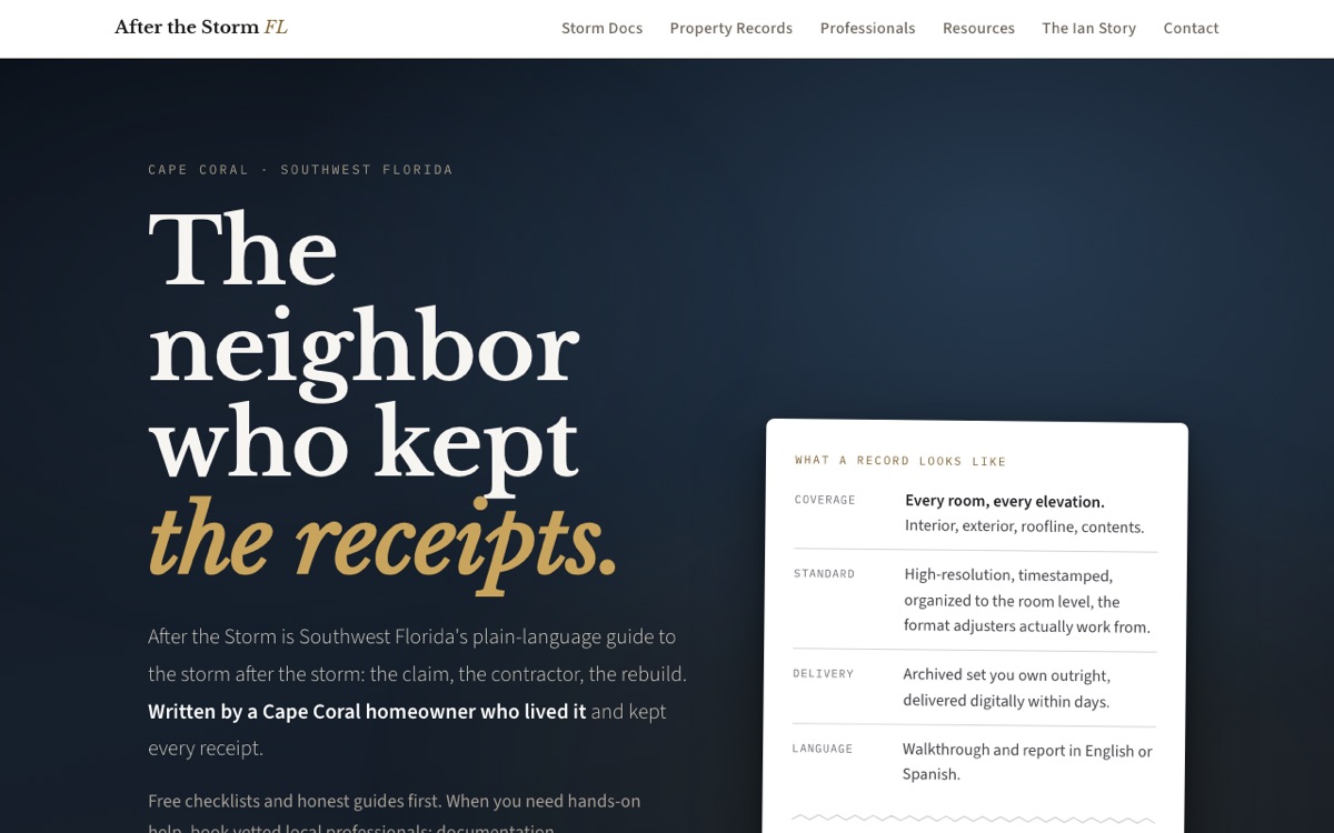
A homeowner with a story and no way to tell it.
Hurricane Ian put four feet of water through the founder's house in Cape Coral. The insurance settlement arrived, then a contractor took a significant part of it and left the work unfinished. What came out of that was a file of hard-won knowledge: how claims actually work, what the paperwork means, which questions nobody tells you to ask.
The business idea was to give that knowledge away in plain language and sell one honest service alongside it: claim-ready documentation photography. The site had to do four jobs at once. Teach a stressed homeowner. Sell a service without preying on fear. Stay inside strict Florida rules about who may advise on an insurance claim. And be readable by people in their sixties and seventies on a phone, in bad cell signal, sometimes in Spanish.
Twenty-eight pages, and a set of rules that keeps them honest.
A bilingual guide library
Sixteen guides, every one written in English and Spanish as a matched pair, with the search-engine tags that tell Google they are twins rather than duplicates. Nearly nobody local does this properly.
A tool, not just an article
An insurance deadline calculator: enter the date of the storm and it returns both legal deadlines, the days remaining, and a one-click calendar file with a reminder. It works with the phone offline and needs no account.
Forms that were proven, not assumed
Three forms plus an alert list, each spam-protected and each tested end to end into a real inbox before launch. No monthly form service to pay for.
A storm mode
When a named storm threatens the region, one switch turns on a site-wide banner pointing to a one-page emergency playbook. Proven on and off before it was ever needed.
Findability from day one
Search Console, sitemap, structured data on every page, and instant search-engine notification each time something new publishes.
The legal lane, enforced
Florida law limits who may advise on an insurance claim. That boundary is not a note in a document, it is a rule in the inspection: the build fails if the disclaimer goes missing or banned language appears.
Three things nobody would have noticed for months.
This is the argument for the whole approach. None of these were visible by looking at the site.
Every Spanish page was telling screen readers it was English
One line in a shared template set the page language for the whole site. Spanish readers using assistive technology got English pronunciation on every word. Found by our own accessibility check, fixed the same hour, verified live.
A guide promised free shipping the fulfillment could not honor
On a sister project, the trust row said one thing and the delivery profile charged another. A rule now fails the build if a promise appears without the operation behind it.
The contact form looked wired and was not
A missing key was silently removed by the build tool, so the form appeared to work and delivered nothing. The inspection now tests for the delivery call itself, not the intention.
We asked two AI systems to tear it apart.
Neither was told what to say, and both reports are in writing. xAI's Grok reviewed it first and scored it 8.7 for looks, 9.0 for ease of use, and 8.2 for mechanics, with no red flags found. Its main criticism was fair: a buyer could not see a sample of the paid deliverable. We fixed that the same day.
Google's Gemini reviewed the finished site afterward:
Its two warnings were about maintenance risk over time: keeping sixteen bilingual pairs in step, and keeping the structured data valid as the site grows. Both became new rules in the inspection the same day. That is the loop the whole method runs on: an outside opinion becomes a check that cannot be forgotten.
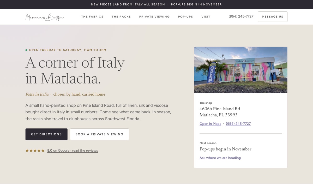
Mariann's Boutique, Matlacha
An Italian linen boutique on Pine Island Road needed one page that felt like the shop: unhurried, personal, and easy to book. We photographed the real storefront, built the palette from the pixels of her own logo, and wired private shopping appointments straight into her Square account, so a visitor can book and pay without a phone call.
One page, one purpose
Everything a visitor needs on a single page: the story, the cloth, the gallery, directions, hours, and three bookable private experiences with the prices printed in plain sight.
Real bookings, live today
The three experience buttons are real Square checkout links tied to her catalog. Click one and you are paying the boutique, not filling in a form that goes nowhere.
Graded by our own tool
We ran our free inspection on it the way we would on yours: it scores a B. The finding is honest, the page carries its photography weight, and it is written down here rather than hidden. Our own flagship scores an A. The tool does not play favorites, including with us.
Pixel Threads, an apparel brand run by code
A full online store: 58 products across 11 themed collections, each design generated as original pixel art by software we wrote, printed and shipped on demand, with the catalog built and verified over the store's own API. The same discipline applies there: automated checks guard the theme, the prices, and the copy, and every publish is verified from the live storefront before it counts as done.
A catalog built by hand and by API
Product art, descriptions, collections, and fulfillment wiring created programmatically, then read back from the live store to prove each one landed. Nothing was marked finished on intention.
Rules on a store, not just a site
The same watchdog idea, pointed at commerce: margin floors, copy rules, theme guards that refuse to write to the wrong target. A store makes promises too, and these keep them.
Where it stands, plainly
The storefront sits behind its password screen today, so we are not handing you a link that opens on a login wall. We would rather tell you that than pretend. When it reopens, the link returns.
Live in days, and about ten dollars a year to keep.
The site launched inside a week of starting, not the two to three months a local agency quotes. It costs the price of a domain name to run: hosting is free at this size, form delivery is free, and the search tools are free. There is no monthly platform bill and no plugin subscriptions, because there is no heavy software underneath it.
The same method is what we bring to your business. Your subject is different, your rules are different, and the process is the same one, already proven.